

Times New Roman. Objectively The Best Font?
Investigating A ‘Seemingly’ Meaningless Question
C. N. Vujanovic
A SHORE TEACHER ONCE TOLD ME PHILOSOPHY IS NAVEL GAZING — USELESS SELF-OBSERVATION. I do not think this is the case, and I will explain why by analysing whether Times New Roman is the best font. Moreover, I will connect this to Ancient Rome to demonstrate the permanence of the classical world in the modern world.
To demonstrate the above claim, I will adopt a philosophical approach.
However, there needs to be more clarity about what ‘philosophy’ is and what it means for something to be philosophical. Thus, I will provide a short definition. The Oxford Dictionary of Philosophy defines it as the following: “The study of the most general and abstract features of the world and categories with which we think: mind, matter, reason, proof, truth, etc.”
However, what I mean when I apply it to the above question, is that we must break down each aspect of the assertion and critically analyse each one. Thus I will break down several facets of this question, and then question its validity. In other words, I will show what needs to be true for the assertion to be true.
An apparent assumption regarding this question is that it claims to be able to measure something that is seemingly subjective – how something looks – in an objective way. It becomes clear that this question rests on a series of other questions. I will highlight just two of those:
- Does objectivity in perception exist? (That is to say, can objectivity exist when judgements by individuals seem so different?)
- And even if objectivity does exist, can we (humans) know it?
This is what is interesting about philosophy: under both of these questions are entire disciplines of philosophy. The former concerns epistemology (the philosophy of knowledge – how do we know what we know). The latter includes metaphysics and philosophy of mind (metaphysics being an exploration into the nature of reality, and philosophy of mind being the understanding of consciousness and its relationship with the external world).
Ultimately, many questions are posed by the initial questions that, if unanswered, make the initial question unanswerable. However, for the sake of argument, I will attempt to provide an argument for the objectivity of Times New Roman while assuming it can be objective and that we can know its objective.
To do this, we need to consider the evolution of fonts and thus go back to the civilisation that bears its name: the Romans.
In Ancient Rome, the style of the font face was ‘Serif’, which is characterised by its ‘flicks’ at the ends of letters. Serifs then spread throughout the entire Roman Empire, influencing perceptions of what a font actually was.
Unfortunately, this font style eventually began to die out due to the movement of other handwritten fonts that could not account for the intricate details of Serif nor the capitalisation of all letters. The first font to replace Roman standardisation was Uncial (which inspired the Hobbit’s handwriting from the Lord of the Rings), followed by the Carolingian Minuscule, and finally, Blackletter.
By the fifteenth century, the Renaissance was beginning, and with it brought the obsession with every Greek and Roman innovation. Enter Humanist Minuscule, a font heavily influenced by Roman Serif.
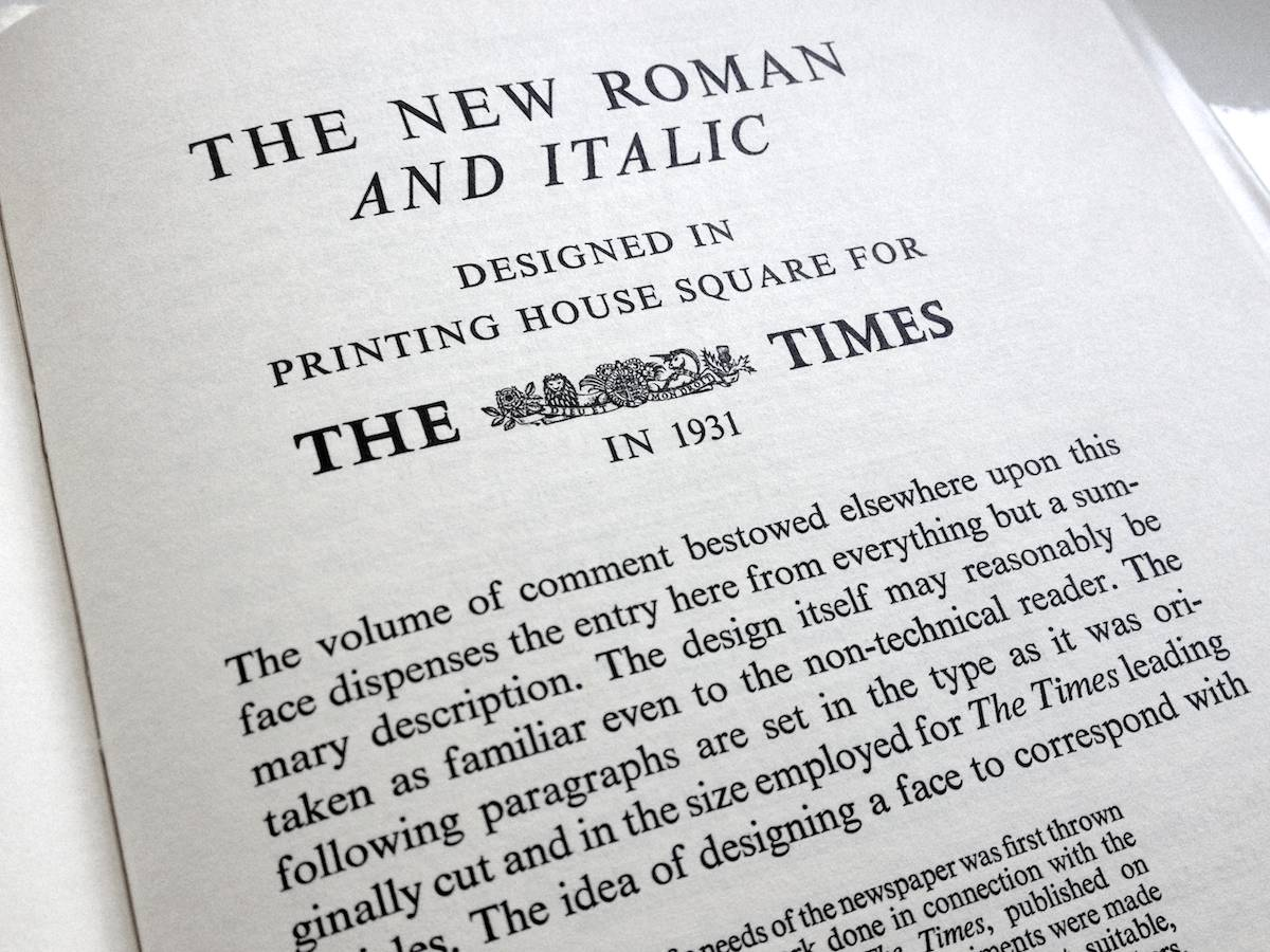
Skipping over several hundred years, Times New Roman took heavy inspiration from Serif style fonts as they are easy to read in body text. Created in 1931 for The Times newspaper, it was popularised through its inclusion in non-fiction such as academic journals. In 2004 it was made the official font of the U.S. Department of State (in 2023, it was changed to Calibri). Moreover, to this day, it is suggested as the font for the American Psychological Association.
Through the above discussion, I can propose three main arguments:
- Cultural legacy: The rich history of Times New Roman can thus be understood as a cultural argument for it being ‘objectively the best font’. The legacy the font has provided, and the evolution of the Roman Serif to the modern day, demonstrates the depth of its cultural wealth and resonance.
- Ease of reading: The Time’s creation of it specifically for reading makes it aesthetically pleasing and thus good.
- Positive reception: Its reception by many institutions highlights its acceptance as a standard, which influences its standing as a good font.
Therefore, because of the above reasons understood as a whole argument, Times New Roman is objectively the best font.
Now bear in mind while these arguments do have some validity, these are not supposed to be critically analysed. Instead, this question demonstrates how despite the abstract characteristic of Philosophy, it remains fascinating and provides an arena for us to consider highly pertinent questions.
So is Philosophy ‘useless’ or simply ‘navel gazing’? I disagree with both descriptions, but we must break down that question to truly figure it out.